 Pixel
Pixel


Live Cohort
March 17 — April 28, 2026
Design Interfaces
That Ship Clean.
A 6-week live cohort that takes you from messy layers to a production-ready design system — the way studios actually build them. 8-point grids, tokenized components, handoff-ready files.
340+
Alumni
4.9/5
Avg Rating
18
Max Cohort Size
The file that makes seniors wince.
Frame 47. Rectangle 12. Group 3 copy 2. Every designer has shipped this file. It works until someone else opens it — then nothing makes sense and every handoff becomes a conversation.
Auto-naming creates 47% longer handoff conversations. Measured across 12 product teams.
A file a stranger can ship from tomorrow.
Layer names as contracts. Every frame describes its purpose, every component follows a naming convention a new engineer can parse on day one. The 8-point grid snaps every spacing decision into place before you make it.
You'll learn: Naming conventions, 8-point grid setup, frame hierarchy, component anatomy.
Tokens that make a designer sound like an engineer.
When your colors have names, your developer can write color/action/coral instead of asking you what #E8836B was for again.
You'll learn: Color tokens, typography scales, spacing systems, Figma variables setup.
Colors with no names, spacing that doesn't add up.
You've memorized your brand hex. Your developer hasn't. Every new screen introduces a slightly different shade of "that green." The spacing values are 13px, 17px, and 23px because it looked right.
Files without a token system average 3× more designer–developer back-and-forth per sprint.
The moment I set up my first token system, my lead stopped asking me to 'just check the spacing' before every handoff. That one session paid for the whole course.
Priya Nair
Product Designer, San Francisco
The dashboard that breaks on every resize.
Absolute positioning feels like control until someone changes the viewport. Spacing set by eye drifts every sprint. Each new component is a negotiation between what you drew and what can actually be built.
Absolute-positioned layouts require 2–4× more developer time to implement responsively.
Scaffolding that responds before you ask it to.
Auto-layout isn't a feature — it's a philosophy. When every frame is built like a flex container, your design becomes a specification. The developer reads your Figma file the same way they read code.
You'll learn: Auto-layout nesting, responsive constraints, component variants, prototype flows.
March 17 — April 28, 2026.
18 seats. 14 remaining.
6 Live Sessions
Every Tuesday, 7pm EST
Figma File Critique
Private feedback each week
Design System Kit
Fintech dashboard, yours to keep
Lifetime Access
Recordings + future cohort notes
Reserve Your Seat
One step. No payment today — you'll receive an invoice after confirmation.
Free Sample Lesson
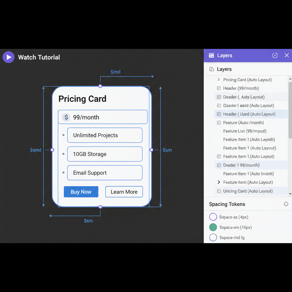
A 10-minute Figma auto-layout walkthrough — the exact technique we use in Week 1. Watch a messy card component become a responsive, tokenized system.
"The auto-layout session alone was worth it."
— Priya N.
"Finally understood constraints in 10 minutes."
— Marcus W.